Memory Keeping · Mini Album · Scrapbooking

Push Print Studio Design Team/The Lovely Pear x Push Print Studio

Testing, testing 1 2 3. Is this thing still on?

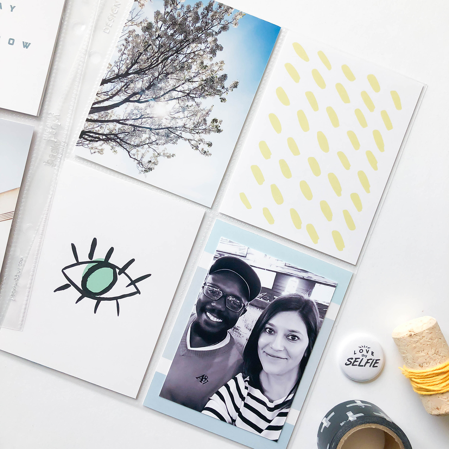
Hey there! Long time no write… er, read? Yes, it’s been a while since I’ve done a blog post and I wish I had a good excuse for not doing so but truth is I really don’t. I’ve just been living life, here at home. Nothing exciting but thankfully nothing bad. I guess you could say my creative mojo completely died there for about a year. Props to those who are still very dedicated in their craftiness. You must show me your ways!

Just when I thought I was done, an awesome opportunity came to me. Caytlyn Cole reached out to me and asked me to collaborate with her on a Push Print Studio set and to be part of her first creative team! It’s not my first time designing cards but it’s the first time I really took it serious! Push Print Studio is my absolute favorite brand to use. I love Caytlyn’s style and I always find something on her website for my layouts.

The Lovely Pear x Push Print Studio is the set I created and you can find it on the PPS website here. Here’s an odd tidbit, I was inspired by skin care products when I created this set. I have been obsessed with skin care and vanity pictures lately! I pulled together this layout to showcase the set and I love the rose theme that came about.

As you can see on this self care list I made, I’m all about the face masks and oils for your face!

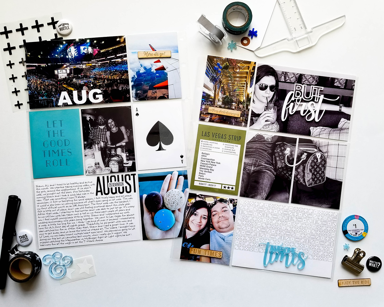
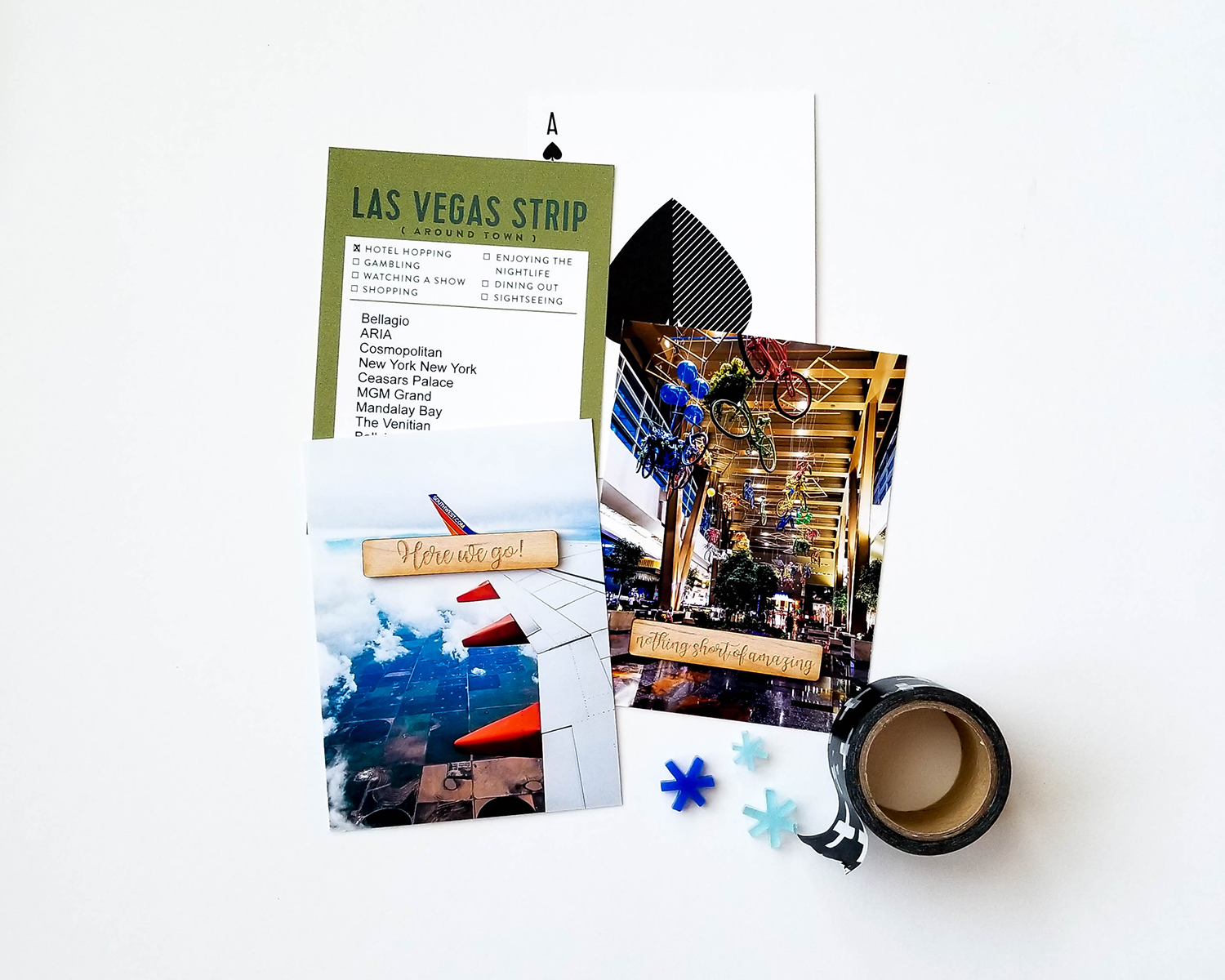
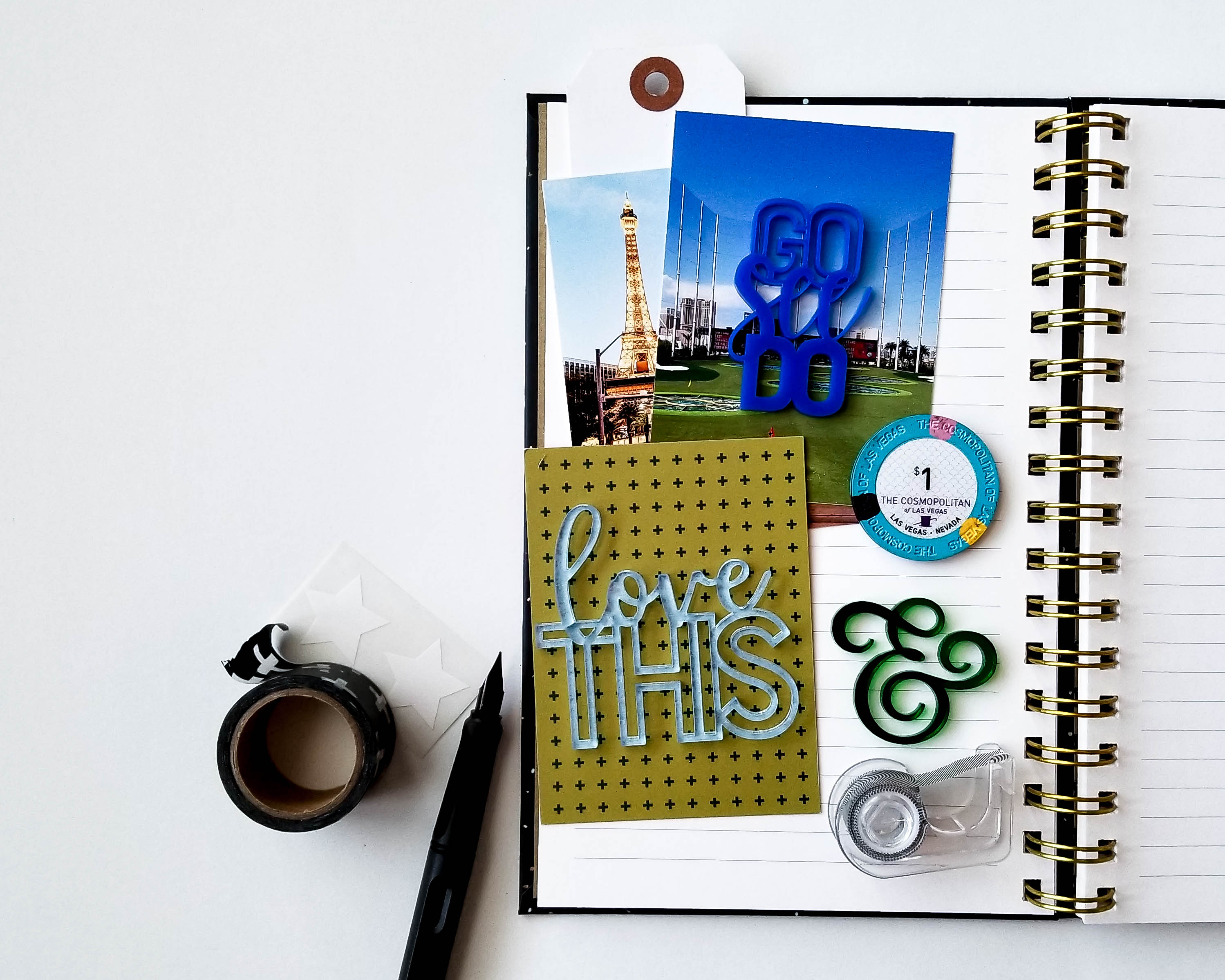
Another collaboration PPS did was with Marisol Ortega and I LOVE this set! I was so happy that it paired nicely with my pictures from a recent Tool concert we went to. My favorite thing to do when documenting a concert is adding the setlist somewhere in the layout. This was the perfect thing to document in my new Jamaica Makes album (I was so excited to finally use this!)

I cannot wait to show you what I’m working on next! Stay tuned!

Project Life

Project Life: March ’18

Hey there! I am sharing my March layout today! Yes, months later but… well, I have no excuse. I have been lazy as hell! Sometimes it’s hard for me to stay motivated. I blame this on my thyroid but I try not to say this out loud because I get the biggest eye roll and sigh from my husband everytime he hears it. I tell myself that my willpower is bigger than my thyroid but it turns out maybe not so much. Or am I really plain lazy? Maybe it’s a mixture of both?

So why am I telling you this? It could be because I feel inspired by Glennon Doyle. I just finished reading Love Warrior and it was so refreshing to read to somebody’s honest opinion. The whole book just felt like a friend telling me exactly how she felt with no filter. Or maybe I’m writing this because of the lack of human interaction I’ve had the last couple of weeks. I’ve been working from home lately and even though I mentioned “lack of human interaction”, don’t take that to mean something negative. I have seriously enjoyed working from home. Do you know how awesome it is to go to sleep on Sunday nights? That has quickly moved its way up to my Top 5 best feelings ever!

So anywhoo, here is my layout:

IMG_2366

During the month of March, my husband and I went downtown for a festival and I took a couple of pictures that set the “tone” for the layout. I really like how this layout has a light feel to it. I didn’t add any embelishments because I wanted to keep this real simple.

IMG_2362

I used the Relax Relax Relax, Wild, and Obsessed printable card sets from Push Print Studio. I altered most of the 4×6 cards into 3×4 inserts with PhotoShop.

IMG_2364

Below you’ll see that I posted the before and afters of the photos I used for this layout. Editing photos is my favorite part! Normally I like to use the same preset per layout but I used multiple presets here.

I used the Montauk Bay preset for the Midland sign. I cropped the picture down and increased the exposure just a tad.

I took this photo outside of Office Depot because I needed some more pictures plus I wanted something to represent the beginning of Spring. I used the Mensch Maschine preset for this picture and increased the exposure to this as well.

This pic is my favorite! I see this building all the time when I drive through downtown and never thought much about it but when we here hanging out right in front of it all day, I noticed all these little details on it. Once I took the picture, I loved seeing all the shades of blue throughout the windows. I used the Garden Grove preset for this, which is one of my most used presets, and then I sharpened it a little more and straightened it.

And the best thing is, these presets are all FREE!

Believe it or not I already did my April layout but I won’t be able to share it here because I made it using the Studio Calico Explorer Documenter Kit for one of their classes. If you have access to the SC classes, go check it out!

I hope you guys have a great weekend!


Project Life

Project Life: February ’18

Hi again! I know, I know, I’m actually blogging again! Believe me, I have missed it but as some of you might know, I’ve been busy! If you follow me on Instagram, you know I decided to start my own business. This idea came to me last year when I had answered the question “what would be your dream job?”. I actually have more than one, but one of my answers was to own my own stationary/paper goods store. I decided to just go for it and during December I registered my store’s name, Bosc Paper Supply Co., here in my city. I came up with the name Bosc because that is my favorite type of pear and I wanted to be able to play off of the name The Lovely Pear. So long story short, I am running my own business online. Will I ever get a store? Who knows but I’m having fun the way it is now. That’s one thing off the bucket list! Now to see Duran Duran in concert so I can mark one more off!

Aside from starting Bosc, I also started a new job which isn’t really a big deal but I’m an over-analyzer so if you can just imagine smoke coming out from the top of head, that was me all February long. Then March I realized there was a stranger living in my house. My little clingy, lovable son went missing and all of a sudden there was a teenager sleeping in his bed. Yes, motherhood has now taken me to the next stage of my child’s life. I don’t know why raising a teenager is hard for me because I practically still feel like one myself! I mean come on, it wasn’t THAT long ago that I was in high school! But then again when somebody says “10 years ago” I think of the early nineties.

Sometimes I think if I had a clone, one of us could take over The Lovely Pear and the other run Bosc, but in all reality, we’d probably both chill on the couch and be lazy together. Wishfull thinking!

I’m going to count everything you just read as my “2017 year in review” and we’re just going to fast forward to my Project Life layout for February.

I decided to go with 6×8 pages for this year, knowing that I’m not going to have as much time to scrapbook. The pocket pages I used were 6×8 Design 3 and Design 4 from Becky Higgins.

IMG_1428

I used inserts from past A Beautiful Mess kits and stamps from past Kelly Purkey kits. For the journaling card, I used one of Kellie Stamps digital stamps. Unfortunately, I could not find the link for any of these items. Boo.

IMG_1430

I didn’t take many photos during this month because I really didn’t think I was going to try to make a layout. I ended up taking some last minute photos at the end of the month around my house and I just love how this page came out! (Psst… you can find those black scissors on the Bosc website!)

IMG_1438-2

Believe it or not, I’m working on my March layout AND… I made a layout for the Studio Calico June Documenter Workshop! I can’t wait for you to see it, it’s one of my favorite layouts!

Thanks guys for coming back, you have no idea how much I appreaciate it!


Project Life · Uncategorized

Color Cast Designs: September ’17 Release

Hey there! Today I’d like to share a quick post with a couple of projects I made with Color Cast Designs’ September release. While everybody seems to be excited for pumpkin-spiced everything, and trading in flip-flops for boots, I did my best and tried to get in that Autum spirit, thankfully this release helped me welcome this Fall season. I pulled out my best flannels, dusted off the boots, and took pictures of as many pumpkins as I could!

I used the new Leaves, Confetti Leaves, and Currently Tags sets for this 6×8 layout.

20171017_115812

For this layout, I documented what I call a “fun” day, meaning “the hubby is in a good mood, take advantage and get whatever you can”! This is like seeing a unicorn, you don’t question it, you just enjoy it while you can and proceed with caution as to not scare it away!!!

I also used the Everyday Edition core kit from Becky Higgins. These inserts matched perfectly with my pictures and the CCD embellishments!

20171017_115829

The “story of today” card below actually has a heart on it, I placed one of the leaves from the Confetti Leaves set over it to give it more of a “Fall” vibe.

20171017_115833

For the next project, I went ahead and made the first page of my October spread. I used inserts from Kelly Purkey’s monthly kit and Push Print Studio.

20171021_115528

The Currently Tags set was also used for this page along with the Autumn Splendor and Lucky Me sets.

20171021_115550

20171021_115554

Autumn splendor indeed!

So far I’m enjoying putting together these layouts, and playing with these Fall colors and embellishments. Hopefully the second page to this layout will come together just as easy! Oh, and hopefully there’s more of those “unicorns” here soon!

See you guys next time!

Project Life

Project Life: August ’17

Hi guys! Yes, you are seeing this correctly, this is my August layout. I skipped June and July, but that’s because I haven’t made those yet and I was really eager to document our Vegas trip. To tell you the truth, I don’t even think I took any pictures in June… so I’m thinking about combining it with July? Not sure how I’m going to work around this but I didn’t want this to be the reason for falling more behind in my Project Life album. The good think is, there are no rules when it comes to memory keeping (what I like to tell myself when I feel like a slacker)!

There’s only one word to describe August, and that word is Vegas. The shopping, the food, the gambling, and the shopping, it was all so fun! I was able to use Color Cast Designs’ new release with this layout, and it was my first time using inserts from In A Creative Bubble!20170907_123544

All the inserts from this layout were from the Las Vegas Journaling Cards set. There are a lot of destination/travel sets you should check out for documenting any fun vacation.

20170907_182953

Thrill Seeker is one of sets I used from Color Cast Designs, I love how it has wood and acrylic veneers, also perfect for documenting vacations.

20170907_123558(0)

And what vacation doesn’t start off with a drink? You can find the white “but first” here.20170907_123617

I trimmed down a  9×12 pocket page that had 4×3 pockets down to a 3×12. I wanted to include this selfie of AJ that he sent me and a couple more pictures of Vegas.

Untitled-2

The “go, see, do” is also a part of the Thrill Seeker set, and “love this” is from the Yes Please set. Love these colors!

20170907_185330

We spent a total of 5 nights in Vegas, I was weirdly ready to come home about the 4th night in, and now I’m dying to go back. Go figure!

Thanks for stopping by, hope you enjoyed!